- Determine precisely the purpose and target audience of print materials so as to choose the most appropriate content and design for each item and avoid wasteful duplication.
Example: A poster from the Turkish government (and UNFPA) Stop Violence against Women campaign, launched in 2004, displays a smashed marriage photograph that lies on the floor; a red telephone on what seems to be a coffee table indicates the method women could use to reach out for assistance. The numbers of major help-lines for survivors of VAW are displayed prominently.

The combination of a few simple, easily recognized items – the smashed marriage picture, the wedding ring on the woman’s hand, the telephone and the emergency numbers – conveys a clear, unambiguous message. Thanks to a “timeless” design which avoids any references to specific communities or region, this type of poster can be used throughout the country as long as the numbers displayed remain in operation.
- Less is more: the design of visuals (e.g. your logo, posters) should be simple and uncluttered. Production of written materials should be limited to the essential. Unnecessary information can confuse viewers and readers, and may distort the message.
- Once it’s printed, it cannot be undone! Pre-test all materials with representatives of the target audience(s), and check and re-check the content of each item before it is printed.
- Consider longevity: Producing print material involves significant investment in design, production and distribution. The material should have a lifespan that is proportionate to that investment. Longevity can be ensured by screening the content for any information that can get “dated” or is likely to expire, e.g. reference to specific events and dates, or statistics or technical information in a field that is rapidly evolving. In materials that are to be used over a long period of time (such as leaflets, information booklets, cards), it may be useful to include an empty space in the design where specific campaign events can be announced, e.g. by using a stamp or stickers.
- Include the campaign logo, contact details for the campaign and the URL of the website – provided the site is attractive, useful and regularly updated.
- Determine the number of copies to be printed of each item, taking into account how many copies can be distributed to the target audiences. Printers tend to offer lower unit prices with large numbers, but it would be wasteful to stock-pile materials that cannot be re-used.
- Attention is increased by engaging people in a personal discussion when handing out leaflets. If print materials are sent to decision-makers, they should be asked for feed-back via a phone call, for example. Handouts and letters are less likely to propel the target audience into action if distribution is not followed through with other activities. Direct contact should be sought with the target audience to establish and maintain dialogue.
- Another way to attract attention is to combine print media with new technologies in a way that supports the campaign message.
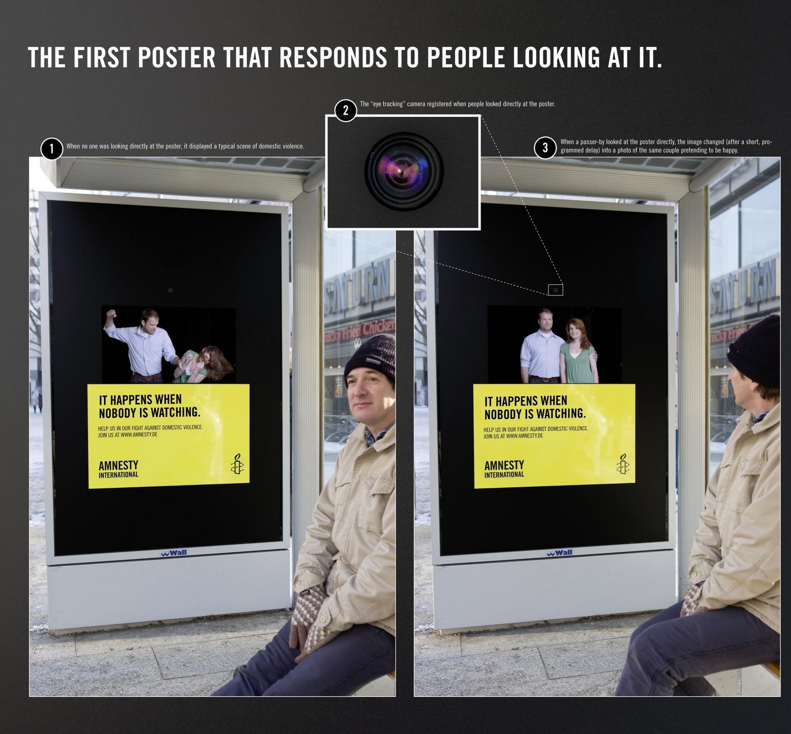
An inspiring example comes from Amnesty International’s Stop Violence Against Women campaign. Posters in glass displays at German Bus stations have been equipped with a face-tracking camera. Each time a person turns her face to the display, the poster showing a domestic violence scene is replaced by an image of the same couple, peacefully smiling at the spectator. The slogan printed across the poster reads: “It happens when nobody is watching”.

Use of such novel technology has the potential to multiply the target audience, as mass media may report on “the first poster that reacts to viewers”. The example is particularly memorable for the clever match between the message and the hide-and-seek effect produced by the technology.